
Relationship between sea level rise and global temperature
This page may be a bit outdated. Look here for my comments on three more recent papers.
One graph that is often put forward to illustrate the link between global temperature is the Archer 2006 book graph (shown below). It looks as if there is a simple linear relationship between temperature and sea level with 20m/degC! From that you would guess that we would be facing maybe 50m of sea level rise. However, there are several weaknesses with this graph.
- No uncertainties (which are huge)
- Eocene sea level is a very poor analogy. Clearly the different sea level is not only a consequence of climate but also of tectonic effects. (e.g. check this map).
Furthermore all the more recent and much more relevant data from the last interglacials have been ignored. That raises the question if the points in this illustration have been picked to simplify the message.
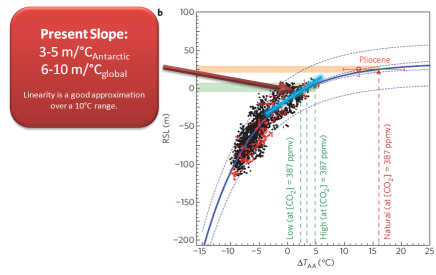
Rohling et al. 2009 has plotted sea level against Antarctic Temperature over the past 5 glacial cycles. From that you can see that the relationship between temperature and sea level is not linear. During glacials where ice volume was large the sea level response to a was also large. In interglacials, with much less ice volume, the sea level response is much smaller.
From the graph it is estimated that for present day we get 3-5m of sea level rise per degC of antarctic warming. Taking polar amplification of (here taken to be 2x) into account we can convert that into a 6-10 m/degC of global average temperature change. (Note that the actual polar amplification valid for dome C is probably somewhat smaller than 2.)
I think that the Archer graph is a nice illustrative cartoon. However, it
is very unfortunate that it is being picked up in official climate
reports like the german WBGU 2006. I have had to defend some of my own work because it was in conflict with a present day slope of 20m/degC.
In this figure below I put the Rohling curve on a 1961-1990 baseline, converted to global temperatures and also added projections (from Grinsted et al. 2009). I used 1.5 as the polar amplification because we are talking about the Antarctic. (But that may be a bit high.)
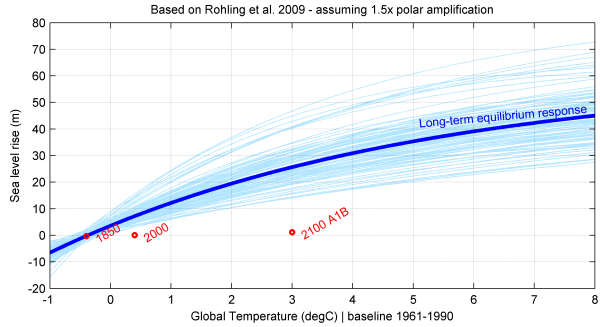
The cyan variations include variations of the form:
- sea level was within 1m of equilibrium in 1850 (standard error).
- polar amplification of 1-2.3 (5-95%). [polaramp=1.5*exp(randn/4)] Note: this is the polar amplification at DomeC.
- Rohling to 1961-1990 baseline correction of 1degC_global with a standard error of 1degC. I am not 100% sure what reference they used but it seems to be somewhere during the current interglacial.
Post script:
This page was written in 2009. Now in 2013, there is a really nice new study on our present understanding of the future long term response by Levermann et al. They get ~12 m for a 3 degC warming. This is consistent with the cyan variations above using the lowest Antarctic polar amplification factor. They also find a less smooth equilibrium curve with a distinct warming threshold beyond which the Greenland ice sheet is pushed into a terminal decay. I invite you to go and read the Levermann paper.
EDIT: Perhaps the pliocene can be used as an analogy, but i question the present quality of the data. A quick google gave me this quote: “Geologic estimates of maximum Pliocene sea level thus range from +5 to +40 m relative to present, with +25 m typically used by the modeling community.” from PLIOMAX: Pliocene maximum sea level project. Combine that with uncertainties in temperature and i wonder if it can give any useful constraint on these types of graphs.
EDIT2: Found a mistake in the polaramplification. H/t to Bart Verheggen.
EDIT3: Added my take on the Archer Graph based on Rohlings curve. I focused on warmer climate.