Ice sheet pessimists are not outliers
Bamber and Aspinall 2013 published a formal expert elicitation on the future of our two ice sheets, and found a large spread between individual expert answers. It has been argued by them, and others that there are outlier experts in the data, and that they drive the long-tails of the pooled uncertainty distribution. I wonder if that is really true or whether it could be a visual artifact from drawing samples from a long tailed distribution.
When you plot samples from a long tailed distribution then of course the tail values will appear to stand out, but that does not necessarily make them outliers. The question is really whether there are two groups of experts optimists vs. pessimists or whether they all have been sampled from a continuum of experts.
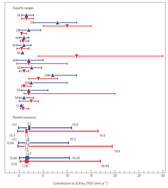
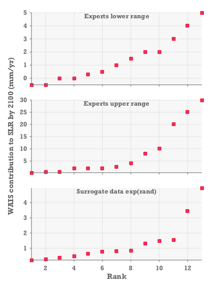
I focus on the expert assessment of the rate of future ice loss from the West Antarctic Ice Sheet (WAIS), as this is a key uncertainty. In particular i use the 2012 estimates shown in red in their figure 1 reproduced on this page. I have digitized this figure to obtain the low and high values of each expert range listed in the bottom of this page.
No evidence for outlier experts
When I rank these values from low to high and plot them then I see that there is no evidence for a discontinuity in the neither experts upper, nor lower estimates. There is no split between ice sheet optimists and ice sheet pessimists. For comparison I also plot some surrogate data sampled from a log-normal distribution, so that you can see an example of how it looks when you draw a small sample from a continuous long tailed distribution.
See also the final remarks at realclimate in relation to the Horton et al. paper: “There is no split into two groups that could be termed “alarmists” and “skeptics” – this idea can thus be regarded as empirically falsified”
Data plotted in graph:
_s=[3.0 0.5;5.0 25.0;1.5 0.5;2.0 0.2;-0.5 2.0;4.0 30.0;-0.5 10.0;0.0 2.0;2.0 8.0;0.5 2.5;1.0 20.0;0.0 4.0;0.3 2.0];

s(:,3)=exp(randn(13,1)); _s=sort(s);
Technical detail: if you draw 13 samples from the surrogate distribution, then there is a 51% chance that the highest value will be greater than 5. The maximum value in the surrogate plot is thus very close to the median value for this distribution. It is not an outlier.