Trends in extreme hurricane damage
I have downloaded the ICAT damage estimates of normalized hurricane damages(/losses) and looked at the trends in the data. This series is often used to argue that there is no significant trend in hurricane damage.
I am convinced that it is simply impossible for any normalization procedure to remove all non climatic influences / societal changes that has taken place over the 20th century. I have previously argued that there are remaining biases in normalized hurricane damage records. Nevertheless this is still an very useful record and we can extract lots of interesting info from this.
Note the analysis below has caveats. Please do not over interpret the plot, although I do find it rather suggestive.
Frequency of extreme damage events

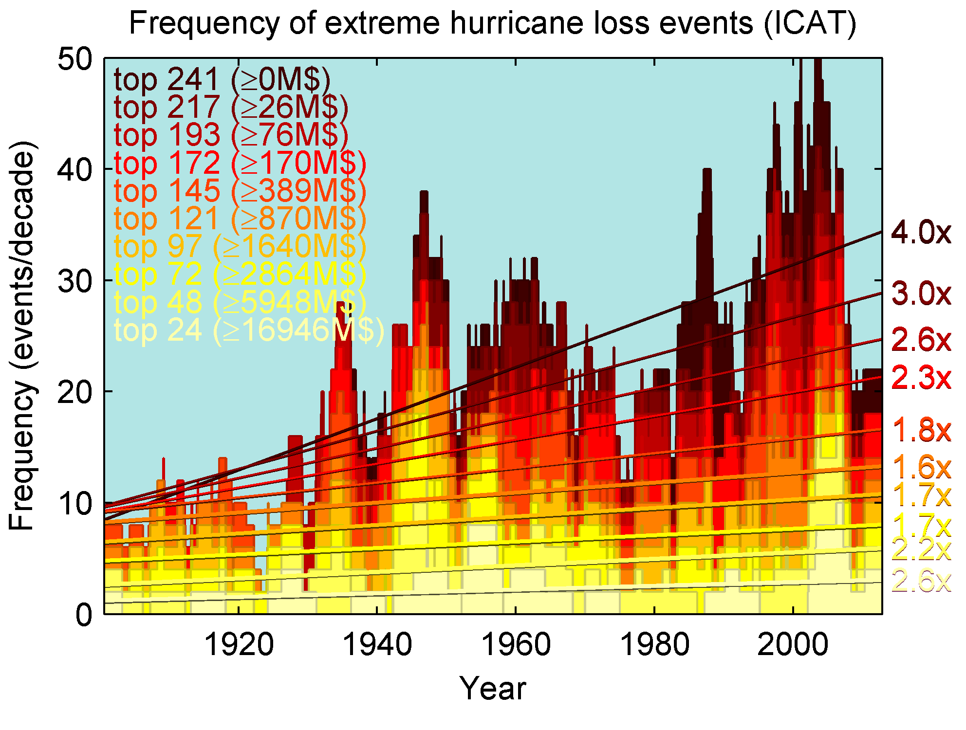
The damage distribution is extremely skewed with a few major events dominating the total damage. We can take advantage of this if we want to figure out whether there are any climatic trends in hurricane damage. The very skewed distribution means that the frequency of events above a certain damage threshold will not be strongly affected by a small remaining bias in damage. We can therefore try to plot the frequency of extreme damage events. This is what I do in the plot here.
A positive trend in extreme damage events of all magnitudes.
The plot shows there is a positive trend in hurricane damage events of all magnitudes. Numbers show damage ratio between start and end of plot. One issue is that small damage events may not have been recorded in the past when coastal population density was much lower. So we may expect a trend inducing bias in the frequency of the most common events (e.g. “top 241”). But this bias is unlikely to influence the trend in the most extreme damage events which are unlikely to have been missed in the past. Detailed examination of the above figure also show that the darker shading disappears from the plot prior to about the 1930s. I therefore recommend to take care in interpreting the trend in events with less than 389M$ damage. However, even when disregarding these then there is a clear trend towards more frequent damaging events.
- Pielke Jr (2005) argues that we can examine events >1bn$ if we want to avoid the above bias. I.e the events with trends ammounting to an increase of 1.7-2.6x in the above plot.
Note if events of all magnitudes are increasing by a consistent ratio, then that means that the expected value is also changing by the same ratio.
Details:
[The thresholds were chosen at the 0:10:90th percentiles. Frequencies are estimated in 5 year moving windows for the background. trends are simply least squares fits to the unsmoothed daily data.]
Data source: ICAT hurricane damage estimator. Damages are in units of 2013 USD. NOW DEFUNCT…
A note about the visualization and color choices
I wanted to plot the frequency for many different threshold choices. One issue is that the largest values on the y-axis corresponds to the smallest thresholds and least severe events. The hot color scale helps because the rare/most severe events are colored with the hottest colors.